Back to home
The Citigold portfolio review is a annually meeting between the client and the relationship manager(RM), to discuss the performance of the client’s portfolio. We are asked to map an improved client and RM journey, and design the digital experience elements.
We delved deep into the dynamics between the client and the RM, We found a highly disenfranchised, disconnected customer base and an overburdened, overtaxed RM work force.
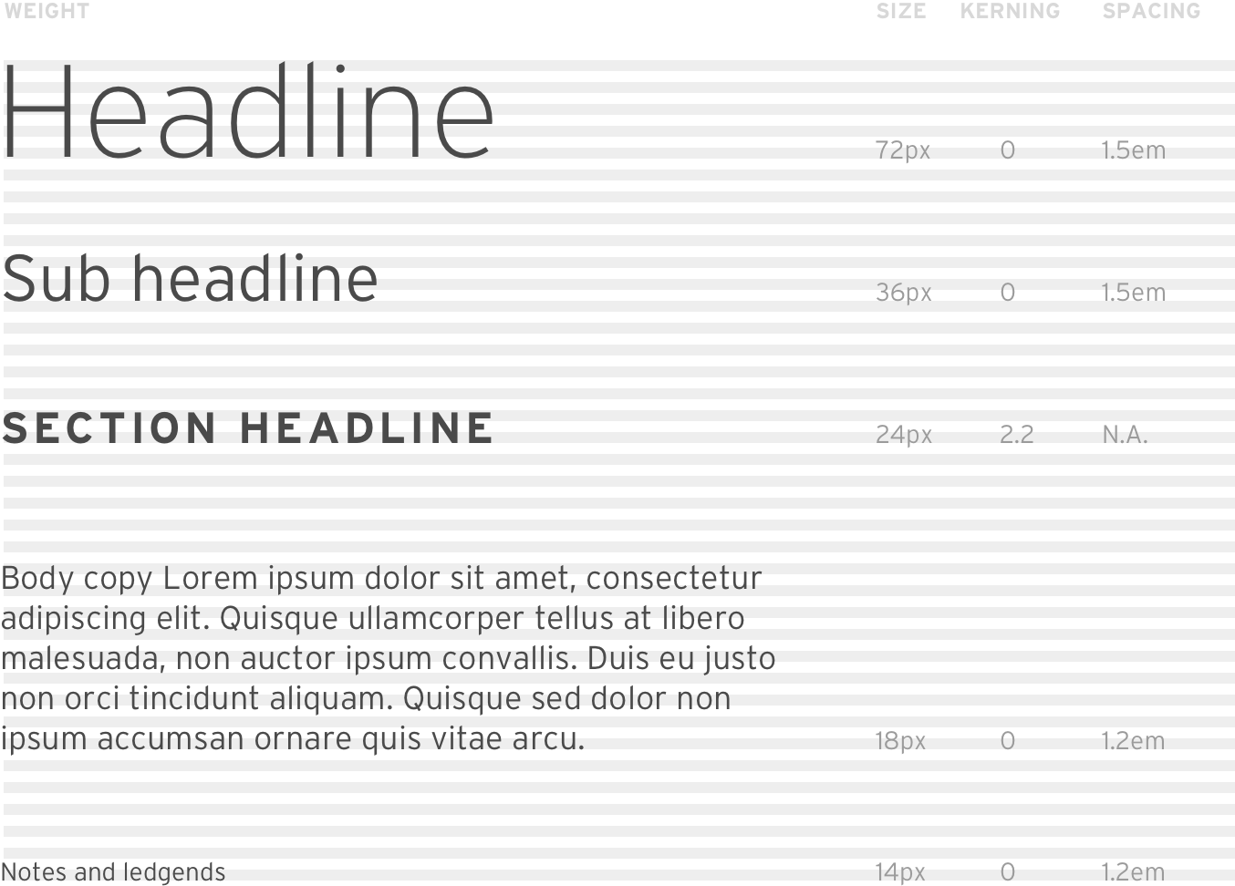
As an Art Director, my role is to provide a refresh to the perceived old-world brand, with a contemporary look, I created a style guide that can be used by multiple designers across different sub projects, in a agile working environment.


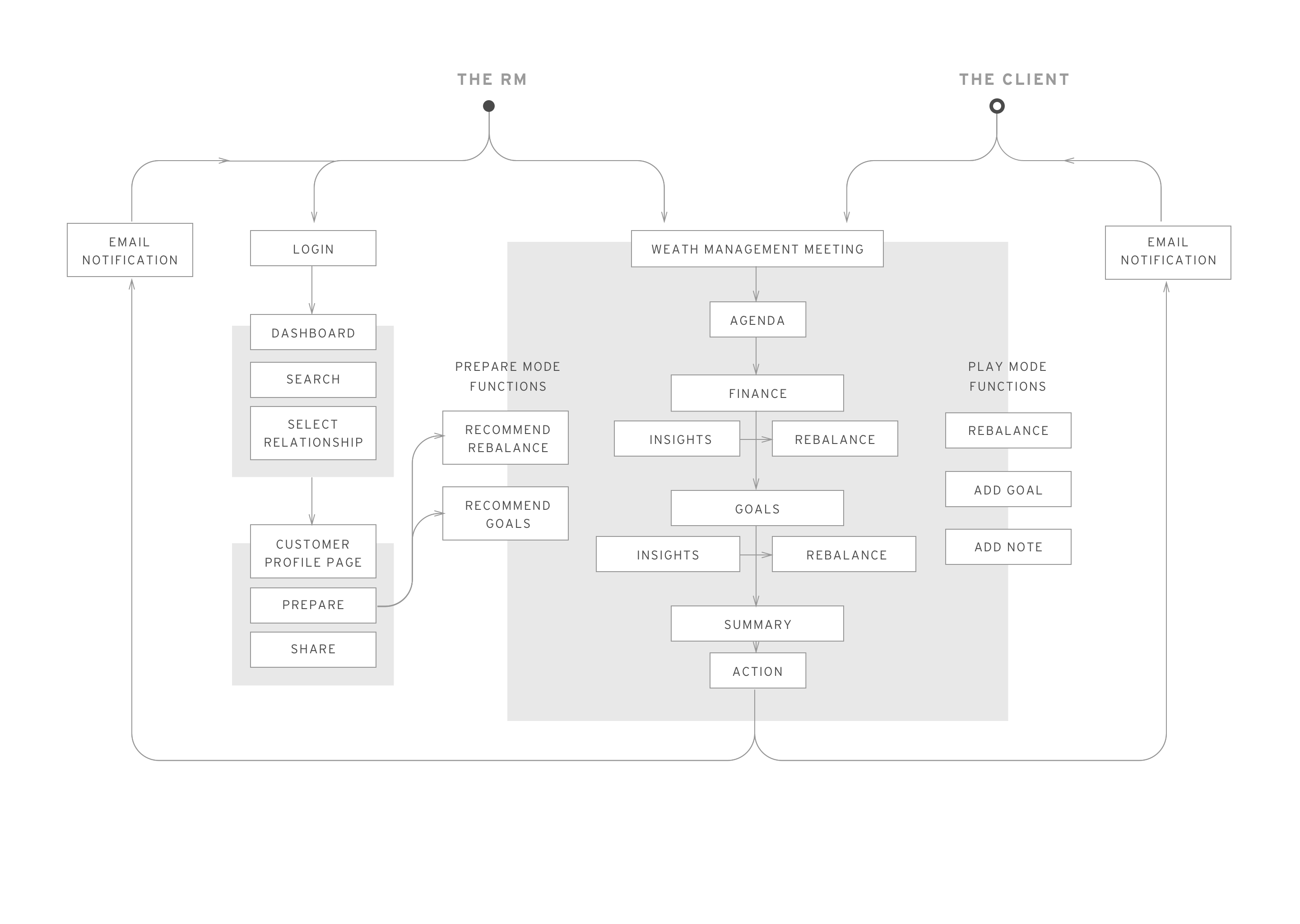
A centralized process, simple to use, allowing RMs to focus everyday on the most important tasks
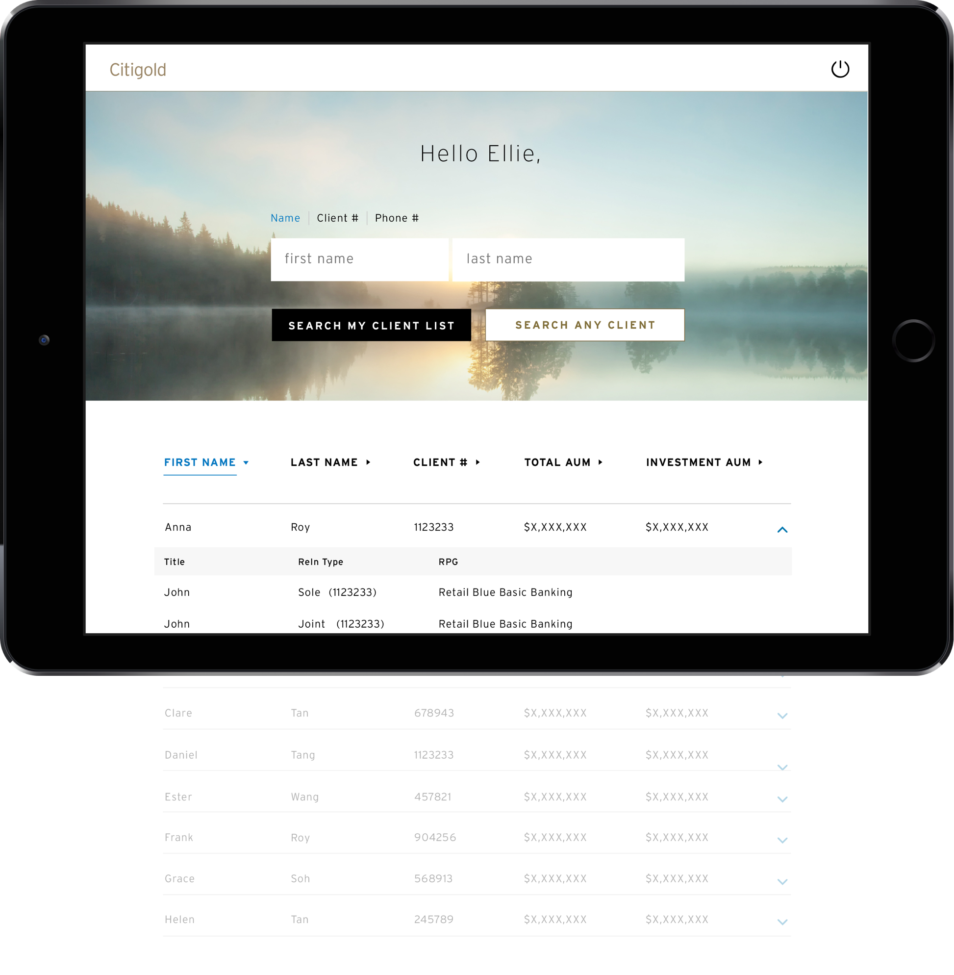
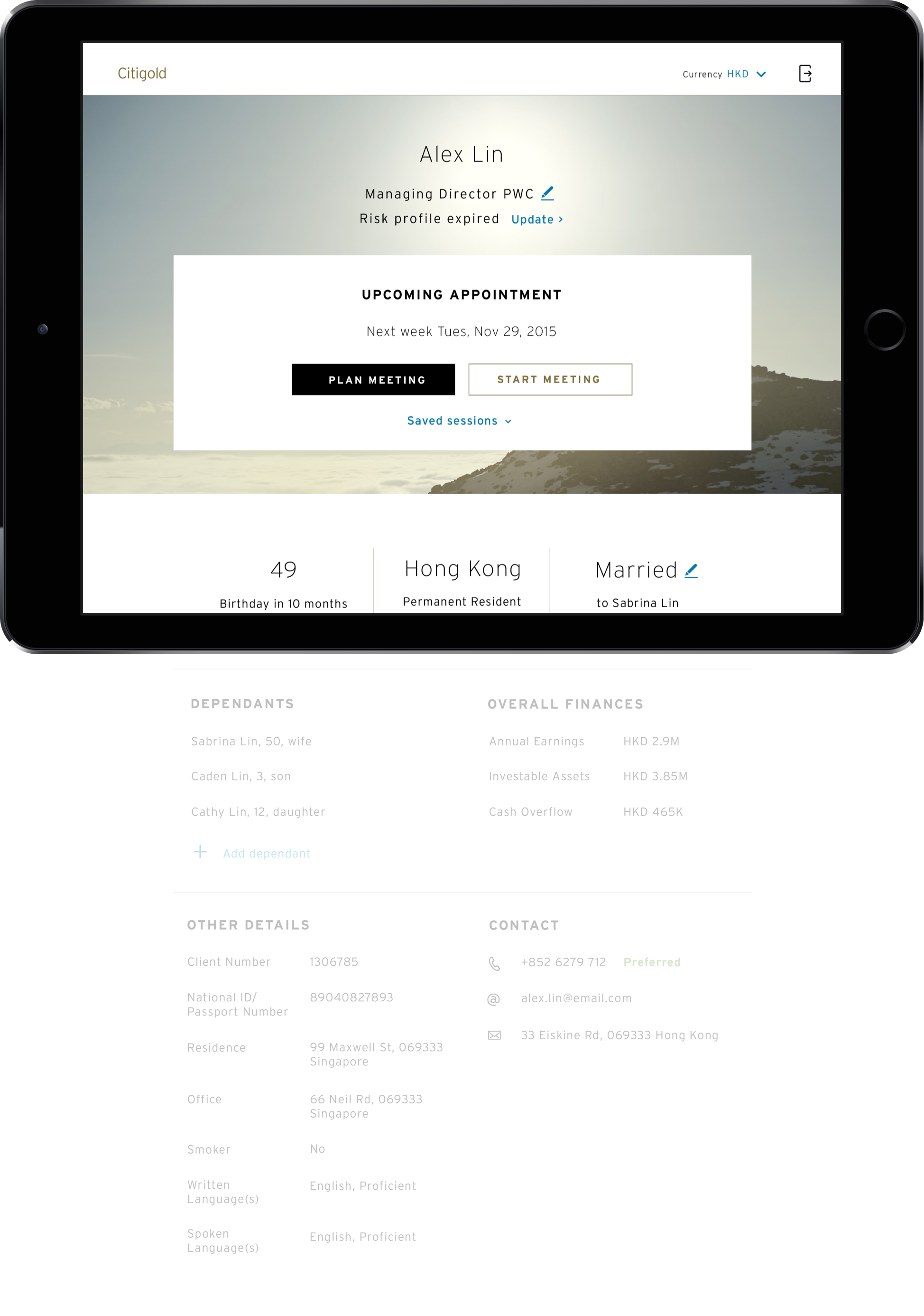
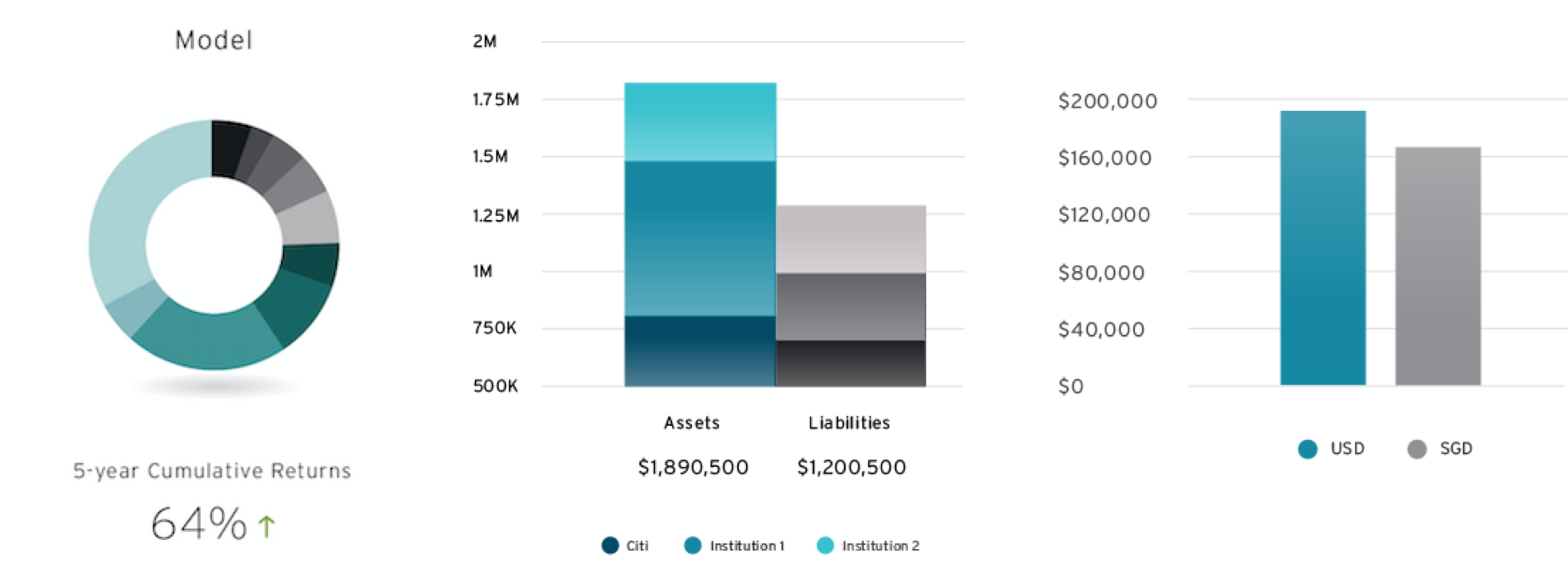
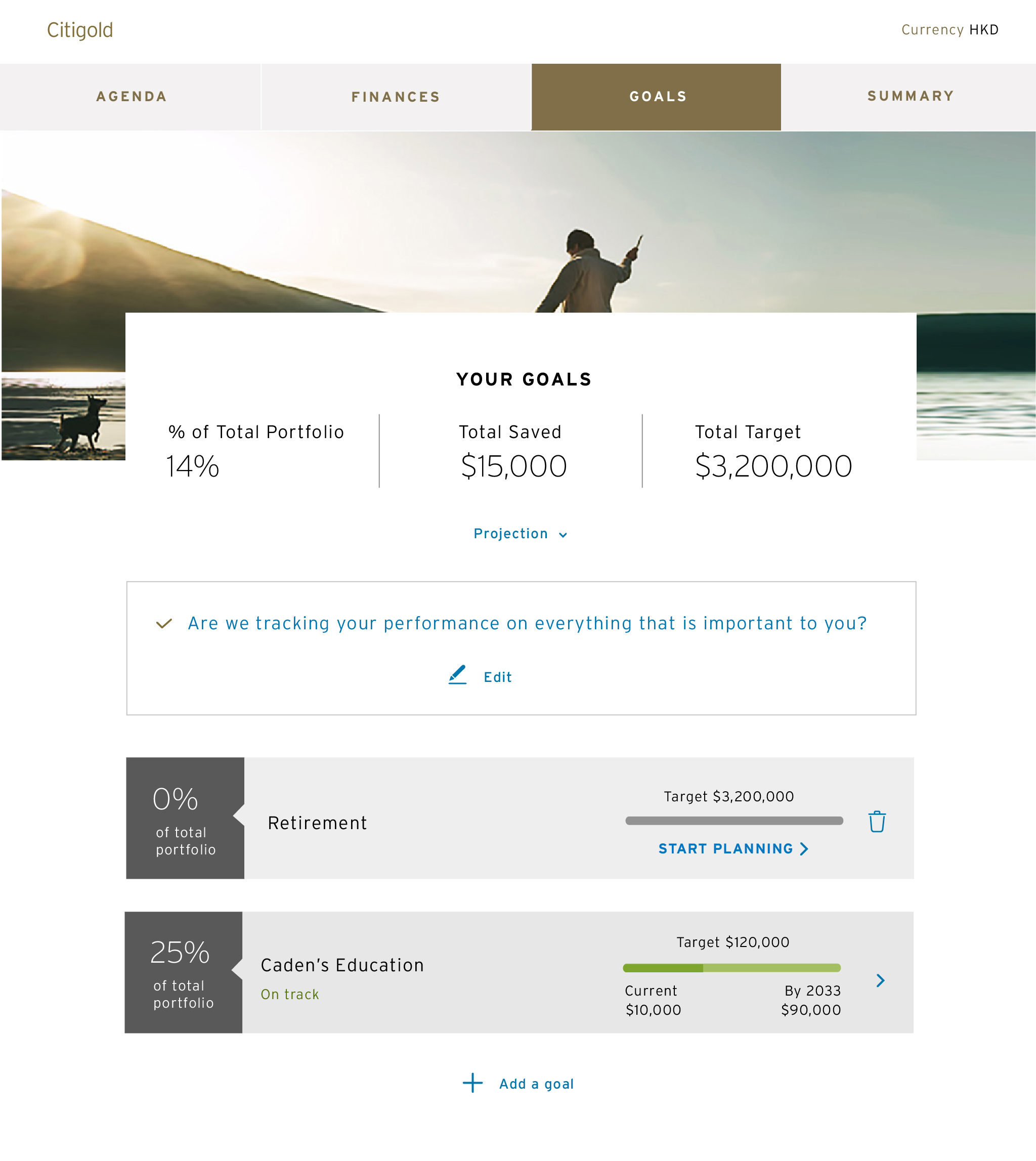
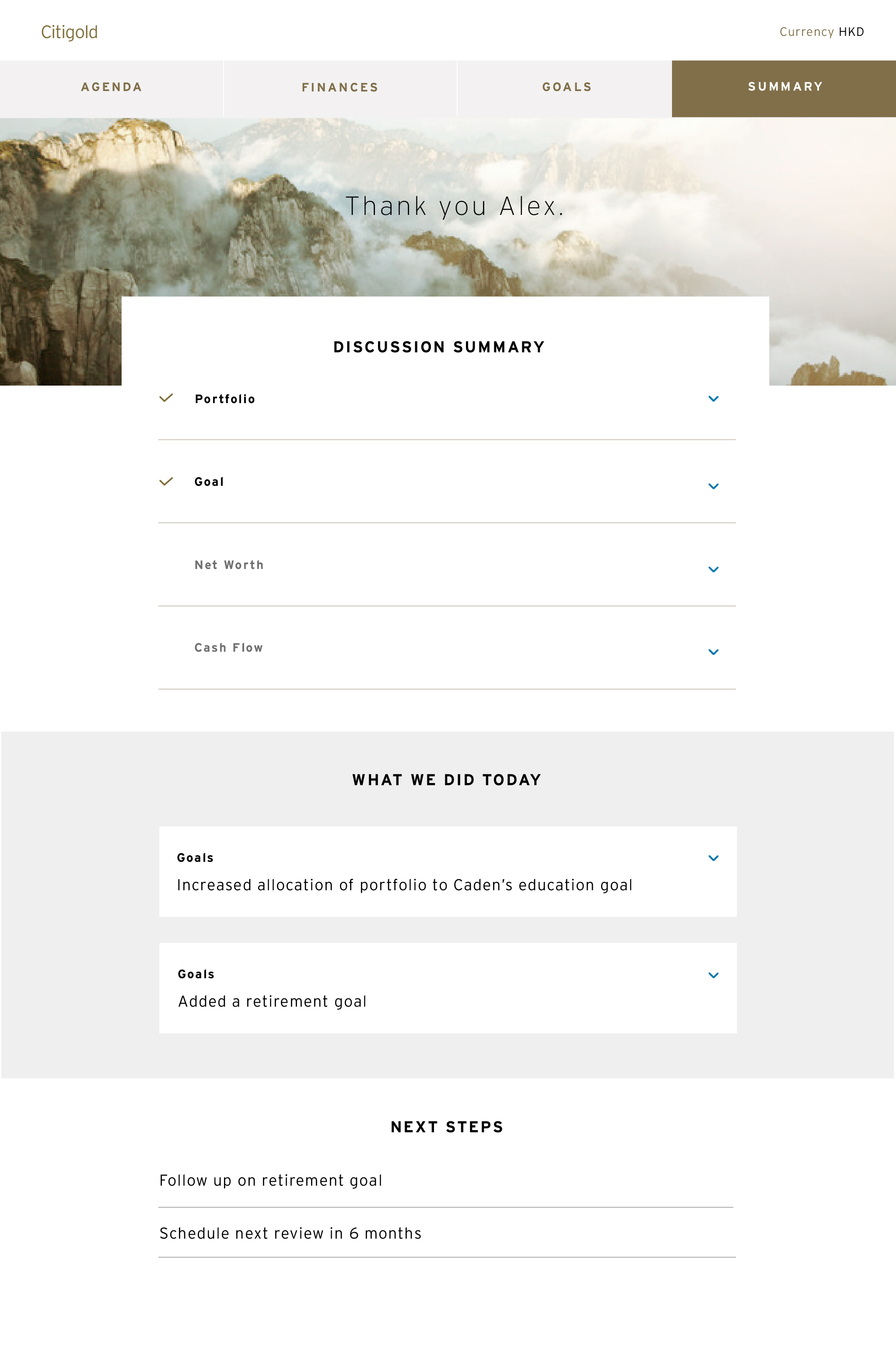
A subset of the dashboard that will allow RMs to maintain and build a holistic view of their clients by consolidating this information in one place
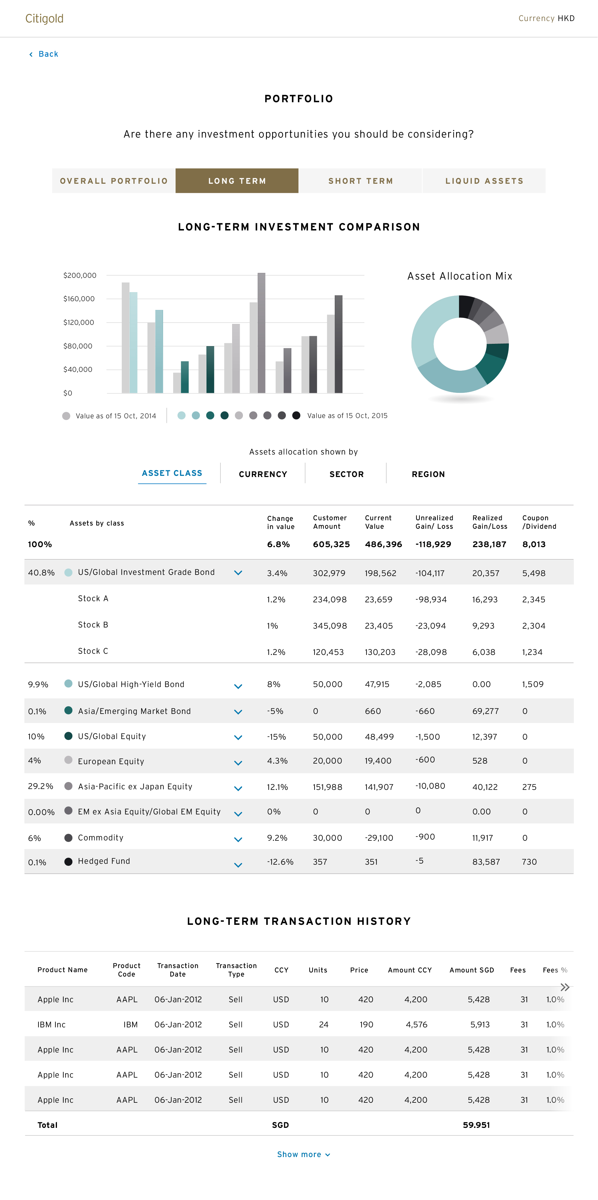
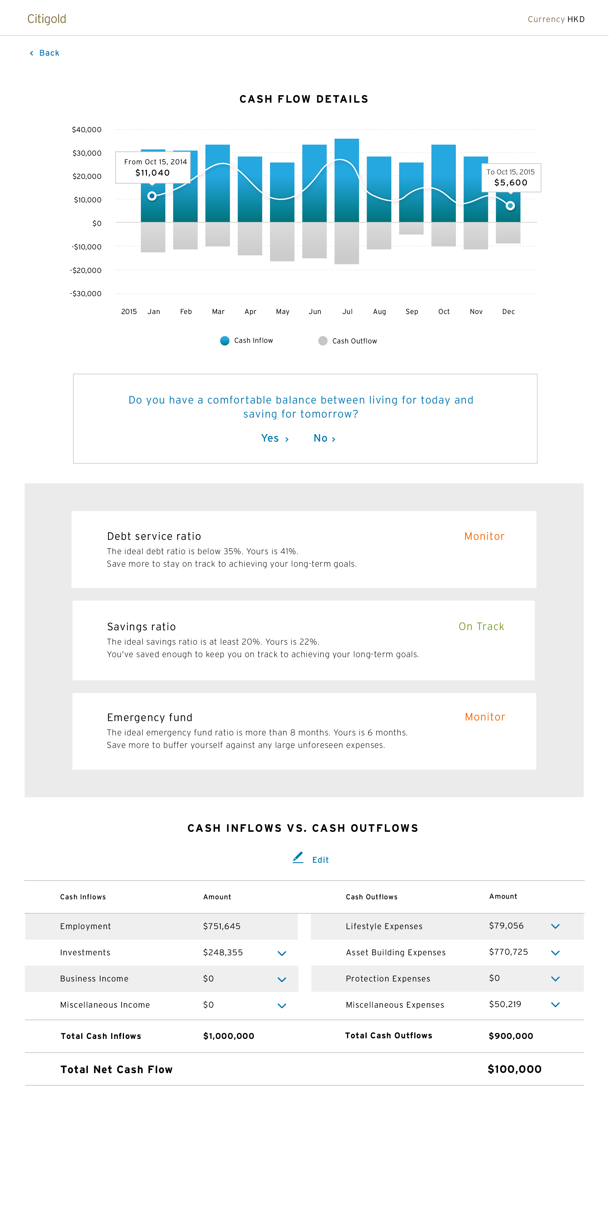
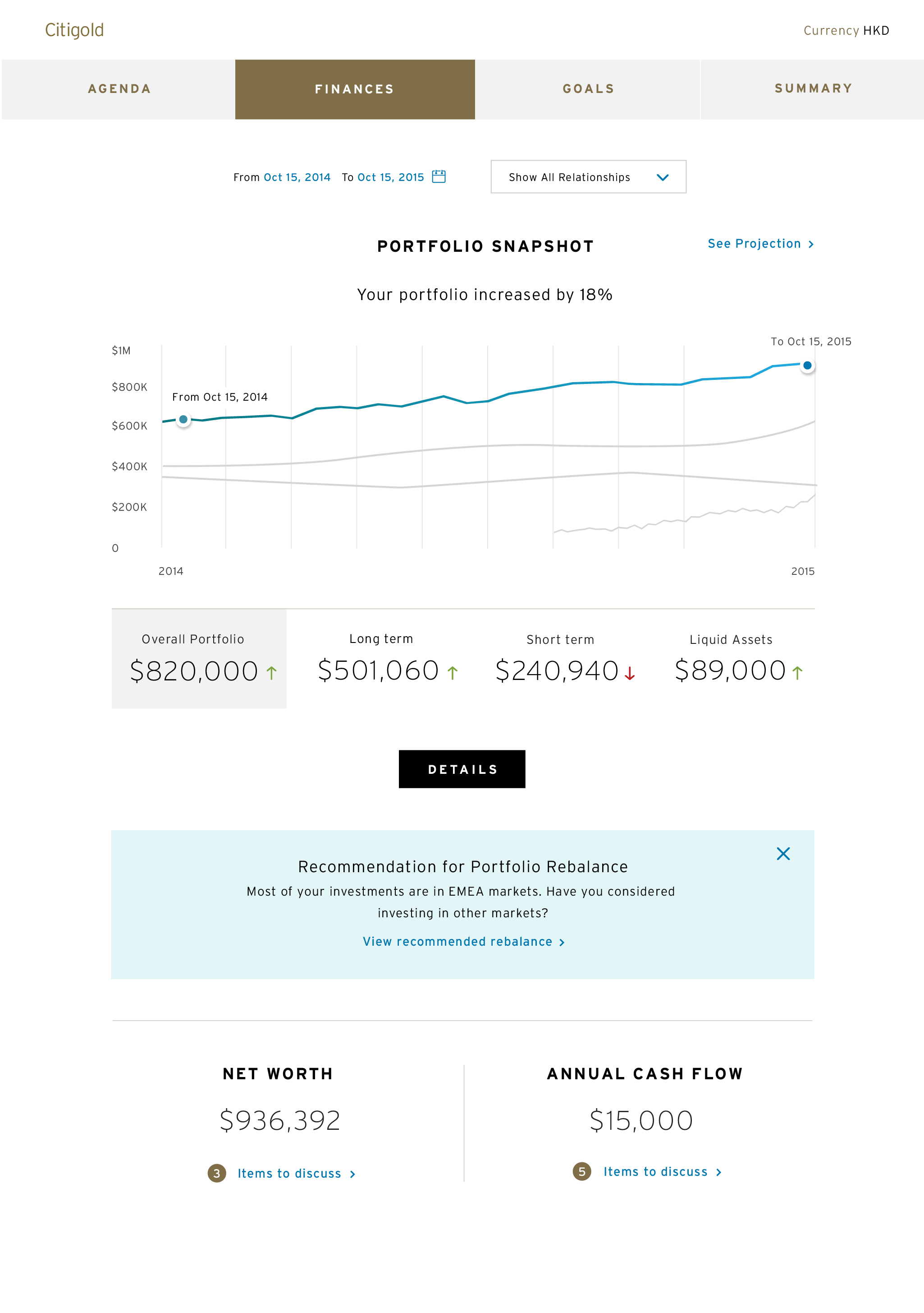
A digital tool with flexible modules of content that enables RMs and clients to focus on what matters when they meet for a portfolio review, making every moment count
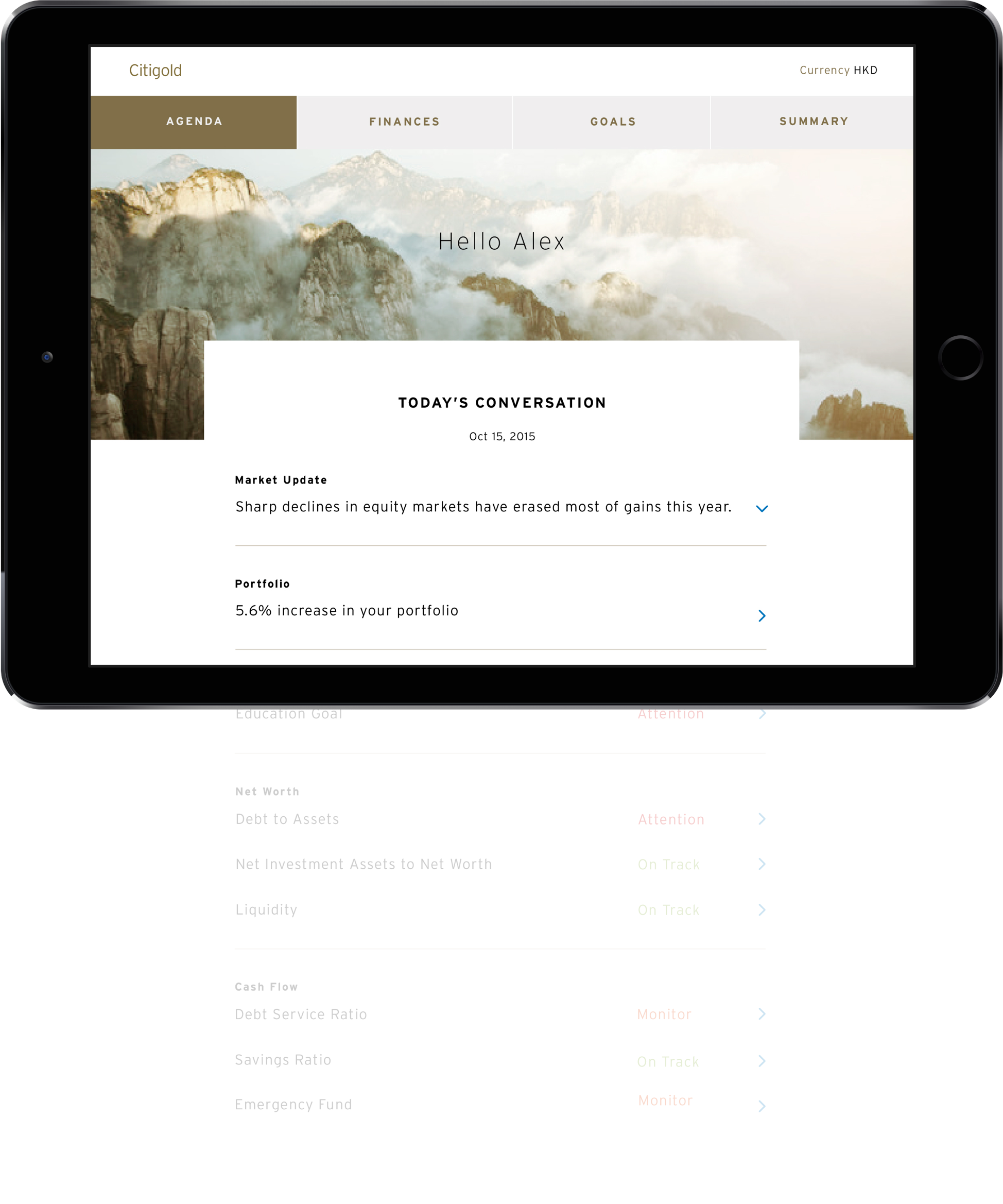
The Gold Conversation generates meaning and inspires action. This requires focus. A par-ing away of what is irrelevant, distracting, useless. An abilityto form and catch an unexpected insight before it gets away. And always an unrelenting focus on you. Your needs. Your goals.


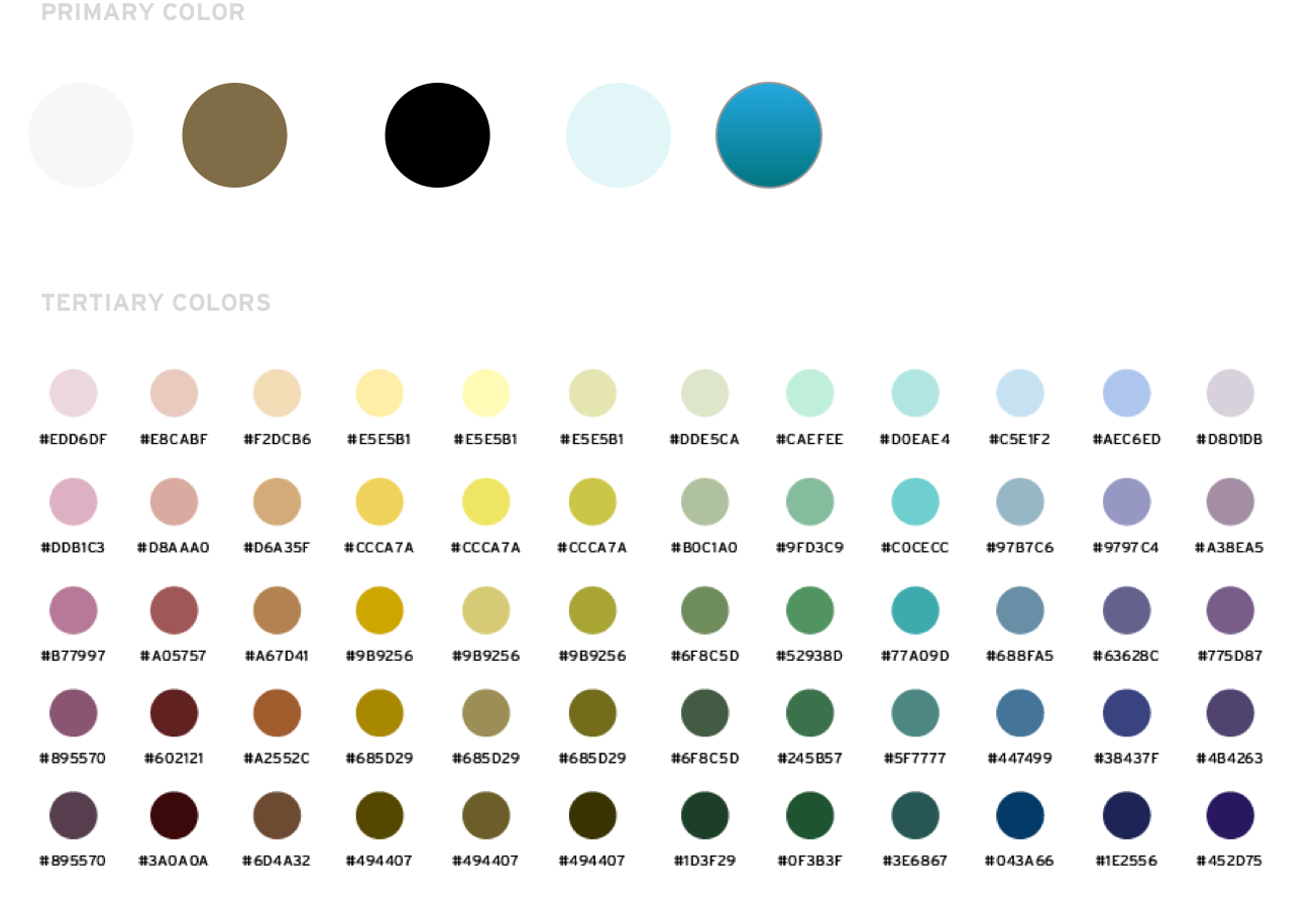
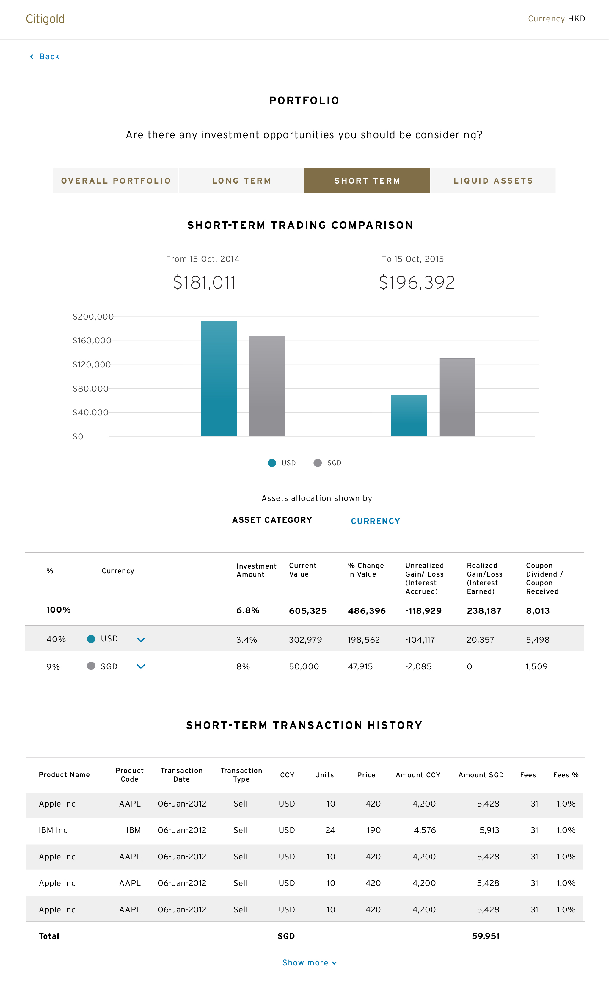
There are 44 colours to represent Citi’s variety of financial products. Products with higher risk are represented with warmer colours.
Interstate is Citi’s brand font. We altered the weight of the font to elevate the Citigold branding from the other tire of Citi’s products, while maximise the legibility for a demographically mature audience.